Showing posts with label Lea and Perrins. Show all posts

Tuesday, 8 January 2013

Main Brief: Final Idea


Overall, I found it rather challenging to produce a label that was eco-friendly and aesthetically pleasing that fitted the specific brief specifications. However., after a lot of research and development I decided that a vintage look label would be the most appropriate.
Front, back, inside.
 The whole label still utilises the orange stripes that can be seen on the current label but in an alternate way. I chose this particular font as I felt that it was modern yet traditional enough to express the traditionalism of Lea and Perrins. On the back label I wanted to make it incredibly obvious that this bottle and cap can be recycled. I decided upon the slogan 'The recipe to start a tradition' as this encourages the consumer to peel the label and use the recipe. Hopefully this will also encourage them to buy more bottles.

Other slogans I debated using were;

* The recipe to confidence
* Sharing the goods
* Worcestershire sauce recipes, its the closest thing to magic

But I felt that these were all too cheesey and not as effective.

On the inside I thought it would be important to title the recipe 'Recipe #1' so that the consumer is aware that each bottle may have a different one.

I tried to entice the consumer into recycling their bottle by flaunting the word 'discount' on the front. Hopefully they would see this and recycle their bottle at a participating supermarket. As mentioned in previous posts the buyer would need a stamp card in order to obtain discount.


Stamp card
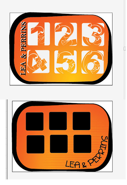
I wanted the stamp card to look more modern than the label but I wanted it to be inkeeping with the design. Therefore, I chose the same font but created a much more contemporary back/stamp area. Each time the buyer recycles a bottle a stamp is given. Once two stamps are collected they get 40p of their next Worcestershire sauce bottle.Obviously more consideration to cost would have to be considered but doing this could encourage new buyers. It could also be done as a promotional offer.

The materials used in these designs are recycled paper and soy ink.
The Lea and Perrins Worcestershire sauce label will be produced by Berkshire Labels who specialise in biodegradable glue.They also do the exact label design (peelable booklet) that this design entails!


Main Brief: Stamp Research


 For some reason, even though I know several exist, I couldn't find many online images of stamp cards. Even though I didn't take inspiration from any of the above images, they help to depict the idea.

The designs I created used the Lea and Perrins colour scheme but did not relate to the label. Therefore my final design was slightly different.

Main Brief: Eco factor.

I had already decided on how to make the label eco-friendly; less paper used and easily recyclable. However, what to do with the actual bottle after use?

I remembered how my parents had mentioned the 'taking the milk bottle back to get money off' technique. I then brainstormed a lot on the train...


I also found these labels from the visit to the factory and annotated the key aspects of each label.

I also bullet pointed the key points I will include in my learning report.

Monday, 7 January 2013

Main Brief: Development 3


Main Brief: Development 2


I think this depicts my indecisiveness pefectly. This is not because I think they're all super, it's actually because I don't like any of them. The first batch, the ovals; I nearly selected the third but I felt that they all looked too much like wine labels. I did feel that these were the most modern. The second batch seem to resemble vinegar bottles too much. When I asked people their opinion they were confused by the drip/spoon with one saying it 'was a bit sinister soooo I left those.

For some reason I was still stuck on the beer bottle shape. I created several designs with slight alterations but using this shape. I kept the stripes from the original bottle on some, whilst others contained the map of Worcester. I  EVENTUALLY selected the middle left to further develop. The best out of a bad bunch.

Sunday, 6 January 2013

Main Brief: Development 1


Main Brief: More Research

So after looking at my 'final' design after a couple of days not looking at it, I decided I hated it and it looked simply awful.

I then went to research even MORE labels (ALLLLLL images from google).


 I looked at the more modern labels as I realised that the 'vintage-ness' of my design were in fact TOO vintage looking. I noticed that these modern vintage labels used several different fonts, a concept I decided to encorporate. I also noticed the wine bottle had a map, consequently I did MORE designs that had an overlay of a map of Broad Street (where it was originally produced).


It suddenly occured to me that I had in fact not researched competors and other sauce bottles. So I did so. The majority of these labels have a black background, which surprisingly works well. However, it looked really tacky within my designs.


Saturday, 5 January 2013

Main Brief: Ideas

In order to help my decision making I decided to print out a few of my designs, and stuck them to the Worcestershire Sauce bottle.

It didn't help, but here are the images...


They all look too much like beer bottles and don't look 'modern vintage' just vintage.

Onwards and upwards!

Saturday, 29 December 2012

Main Brief: Lea & Perrins Visit

Apparently people being allowed to tour the Lea & Perrins factory is a rare occurance. So it was a privilege to be allowed to do so. In fact the whole visit was rather surreal.

We had to wear these items (amongst bulky safety shoes)

and looked as cool as this...


The factory itself was completly different to how I had imagined. It was a lot smaller and a lot more traditional than I had envisaged and they had kept a lot of the original architecture.  I feel that this vintage approach comes across in their packaging. Initially I had no idea what to expect smell wise, this is partly due to the fact I have never (and still havent...) tried Worcestershire Sauce. The smells were incredibly strong and we were immediately greeted with the smells of garlic, vinegar and onions. It was apparent that all the people who worked there were passionate about their job and the roles they had to play in such a tight knit community. Each worker we met was incredibly helpful, informative and plesant.

The main thing that stuck with me from this visit was Lea & Perrins ambitions to become a company that has 0% waste sent to landfill. During this tour we were informed that only the juices from each ingredients is used, consequently the remaining pieces of ingredients are composted and turned into soil.

Entrance

Current labels
 Overall, it was a very informative visit that gave me a clearer insight into the brief.

Considering we've both never tried the sauce, I think this sums up how we felt...


Tuesday, 27 November 2012

Main Brief: Label research

After my incredibly rough designs I realised that the best route to go down would be creating a label that does not go all the way around the bottle. This would use less ink and less paper. I then decided to research labels from different company's whose product was sold in bottles.

 As I have mentioned in a previous post, I like the idea of using a vintage theme. I decided on this as I feel that it helps to express the longevity of Lea & Perrins, I also feel that 'vintage' is becoming fashionable again.This being the case, I then researched vintage labels and found...


Even though most of these labels belong on beer bottles I believe that a design influenced by such images will be perfect for Lea & Perrins.

All images from Google.

Monday, 19 November 2012

Main Brief: Rough designs

After being delayed and locked on a train for a very long time (from Liverpool to Worcester) my mind decided that it actually wanted to think about university work. Consequently I decided to write down anything that came into my head, essentially brainstorming/mind mapping, about Worcestershire sauce.

My first thought was;
                       "How come the majority of people I have asked haven't tried Worcestershire sauce?"
I then thought about why I haven't tried it. The answer? Money.
                           " In what way could you get the sauce for free?"
Okay, so granted this wouldn't be what Lea & Perrins would want to hear. However within this thought a question arose...
                                   "Do Lea & Perrins do sachets? like pub sachets?"
Well personally I think they should as I believe this would help promotion.

Everybody seems to keep linking 'innocent smoothies' to Worcestershire sauce recently, I'm yet to figure out why. However, it made me think about why they are successful (apart from being delicious). Is it their advertising? Is it their "quirky" design. (huge *sigh* at the word quirky) Innocent smoothies are amongst several businesses (ribena, extra chewing gum, etc.) that give objects human/animal traits. For example, berries that talk, onions that can walk. Therefore, as a marketing campaign, can the Worcestershire sauce ingredients be personified? Will it fit the target group?

I then began to think about the general population and the previously mentioned 'WHAT DO I GAIN?!' attitude. What DOES the consumer gain? it's eco friendly, it's the original taste and it's not that expensive. 

How can it be sustainable? less ink=less bleaching during recyling. Can it be re-used? Recycled/natural materials? Refilled (like milk bottles)?

I drew some rough designs on the train in my journal (that I'll scan in on a later date) but because they were incredibly scruffy I drew them on illustrator. THESE ARE INITIAL TEN SECOND IDEAS.


I like the use of the lid label on #2 and will probably continue this throughout my designs. Something I probably won't include, because everybody will, is the use of the Worcester cathedral in #2 and #3.

Monday, 29 October 2012

Main Brief: Research

The brief suggests that one method to increase sales is to promote ways in which Worcestershire sauce can be used in recipes. The label or packaging may include recipe cards in order to inform the consumer of innovative ways to create an appetising meal involving Lea & Perrins.

The Lea & Perrins website actually includes some of these tips and recipes on their website. So maybe they need to be promoted more as they are easily accessible.


The brief mentions that the 'iconic bottle shape' has to remain the same...


I then researched the advertising of Lea & Perrins Worcestershire sauce to see whether the styles of advertising could be incorporated within my bottle designs.


I actually think that these old advert designs may influence the packaging I design. This is due to them being aesthetically pleasing.


The most recent advertising has used witt and humour in order to captivate the target audience. I think that this kind of humour should be used on the label recipes (if they are used). It is also mentioned HERE.

Main Brief: Lea and Perrins

'Attract a new generation of Lea & Perrins users through educating and exciting them of ways to use L&P in their everyday dishes'

Objectives:

*Create a pack design that is attractive to the 20-35yr old age group
*The pack design needs to inspire people to use the product in their everyday cooking
*The packaging should be made as sustainable as possible and adhere to the Heinz Corporate social responsibilty guidelines


Mandatories:

*Retain the pproud branding (Orange & Black)
*Retain the iconic bottle design
*Keep the original and genuine feel ofthe product


Considerations:

*The pack should stand out
*Attach elements to the bottle such as recipe cards
*Sustainability themes of refill, recyclability and bio materials should also be considered


 Key points from the Worcestershire sauce history:

*First sold in 1837
*Produced in attempt to recreate a taste found in India
*Originally tasted horrible, so was put in a cellar and forgotten about. Found months later and tasted. It was found that it tasted a lot better.
*Process and most spices kept 'secret'
*Although it is known that it contains onions, garlic and red chillies